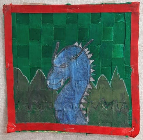
The original piece was a painting of Sapphira, the dragon from the Inheritance series, which I was devouring at the time. This was for one of the rare assignments in my 7th and 8th grade arts and crafts assignments. The task was to paint a line drawing of an elephant on a piece of fabric. I can’t remember if the teacher had specified that it needed to be satin, but I do remember that she had a template for the elephant.
I’m beyond grateful for the teacher’s patience in letting me interpret the assignment quite so loosely. . When I told her my idea, she just sort of sighed and said okay. If sighs can be warm, this one was. I remember my excitement to draw the dragon, but I distinctly remember that the choice to use the woven satin ribbon was simply because I had a bunch of satin ribbon in my craft drawer.
Palimpsest Process
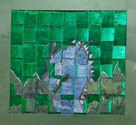
The Palimpsest Process #3 Blue Dragon
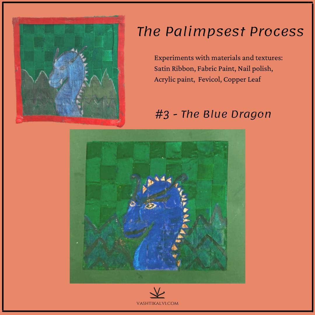
The Palimpsest Process #3
A recurring theme of this series has been that decisions about materials, in particular, weren’t thoughtfully made, so much as they were just shaped by what I had with me. Some of it was to do with how expensive art supplies were, so I was trying to make do with what there was. But most of it was just wanting to find use for the many little things that I vaguely collect. My drawer of nonsense, which became a box, and is now, in my adulthood, a stack of shelves.
So, I wove strips of satin from my drawer of nonsense into a mat, and stapled it onto a piece of cardboard, from the cover of an old notebook. It is baffling how the weave held together the way it did. It was uneven, and I hadn’t used any stabiliser. I don’t know how I managed to transfer an image onto not one, but several mostly detached pieces of satin.
My first step in redoing this piece was to take it apart. It’s a little absurd how many staples and pieces of tape I removed in the process. The use of tape in the new version has been drastically minimised, optimised, even, and I didn’t use the stapler once.
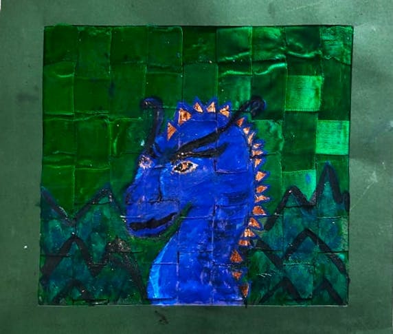
The first time around, I used tracing paper, and then carbon paper to transfer the picture of Sapphira from the book cover. In redoing it, I wove the ribbons back together more evenly, and then painted over it to make the image solid.
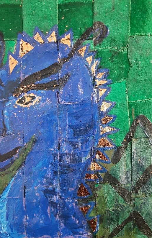
And of course, the material I used came down to what I had. Except my collection of nonsense, now called the Arts and Crafts shelf, is much bigger. I used metallic purple, and dark blue nail polish as the base for the dragon, and painted scales over it in fabric paint. I used fevicol to stabilise the mat, and used copper leaf for the spikes.
I wasn’t remotely attached to the dragon being Sapphira from Eragon this time. I’ve had a sheaf of copper leaf for sometime, and was thrilled for an excuse to use it. I used it for her spikes, her eyes, my nails, and managed to slip some into the next piece as well.
I realise this new dragon is a lot uglier. It wouldn’t be an exaggeration to say I got tearily upset about it when I was painting it. But I still really like how it turned out, and am so aware of the luxury of that feeling. I’ve been fascinated by the idea of using metal leaf in paintings since I discovered Klimpt, who I’m now seeing has influenced my art a lot more than I was conscious of. And I got to use copper leaf, which I just had with me, to paint a dragon, and I didn’t have to worry about being graded for it, or even having it be particularly pleasant to look at.
The scenery behind isn’t particularly imaginative, but I love the contrast of the textures and colours, even against the green satin ribbon. I appreciate that sense of dimensionality that my drawing finally has, after all this time. I’ve made my peace with the mess of the eye on the left, but I love the sassy copper eye on the right.
Maybe the goblin instinct in me that collects little things just enjoys shiny things, but I strangely enjoy looking at this strangely mottled piece.